Case Study: Word on Tablets
Microsoft Word is historically a WIMP application – the UI was heavily optimized for mouse and keyboard input over the years. As the consumer market moves beyond the desktop we set out to reimagine the Word experience for a variety of devices and inputs. Our goal was to increase overall user engagement on tablets, especially edits to existing documents.
Working on a small team lead by Ruth kikin-Gil, we designed experiences for text selection, insertion, and the on-screen keyboard optimized for tablets.
Research
I started by reading up on market research from our awesome usability team to get a sense of who buys tablets, who uses them, who might use them in the future, and how they’re used. Tablets are a fascinating device category with a large potential for growth.
Customers buy tablets with hopes that they’ll get more done. Unfortunately, they often find the device falls short.
To find out why there’s this mismatch between productivity expectations and reality, we turned to usability studies. We discovered a huge amount of pain working with text. Even the most basic document editing tasks are worlds more complex than tapping out a text message on your phone. Users were caught in an uncanny valley, attempting to use text interactions they learned on desktop computers, with a mouse and keyboard, with their fingers on a tablet. It rarely worked.
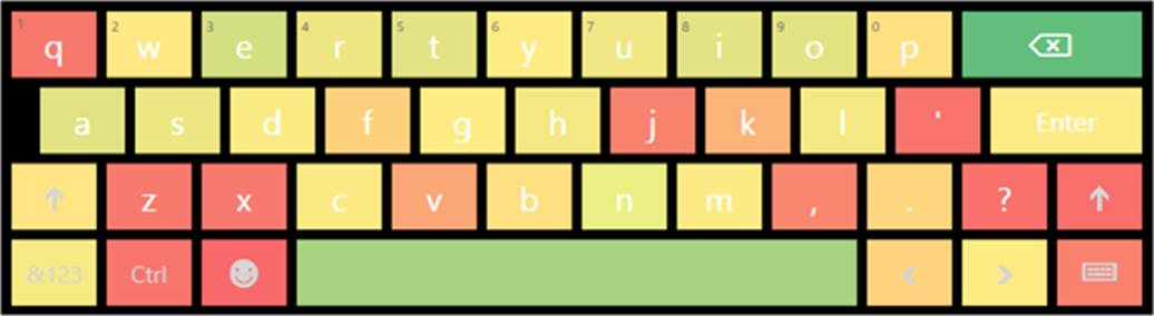
Users also had trouble typing on a tablet. To confirm this, we looked at analytics data. Backspace is the most frequently hit key.
At the time, Word wasn’t available on iPads or Android tablets, so I also looked at what the popular alternatives were on those platforms and took them for a test drive.
- iA Writer
- iOS Notes app
- QuickOffice
- Google Docs
Ideation
We did a lot of sketching, talking, and organizing to help identify the biggest areas that we could work on in several group brainstorming sessions.
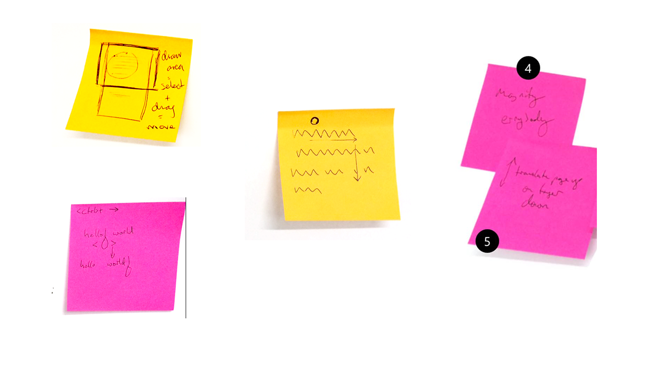
Rapid sketches for a affinity diagramming exercise.
The two largest problems that we agreed on were text selection and how annoying the on-screen keyboard was to invoke and dismiss.
Prototyping
I was able to quickly take sketches to high-fidelity interactive prototypes by coding a native Windows app that was a “smoke and mirrors” replica of the real Word (the Ribbon was mostly images, only enabled specific flows).
The prototype allowed text editing and formatting, as well as controlling the real on-screen keyboard.
This allowed us to test the prototype with coworkers and run usability studies where the participants to completed realistic tasks. It took dozens of iterations before we were confident enough in a solution to build it.
Telemetry
While usability studies are a great tool, you haven’t succeeded until the numbers reflect that. In addition to looking at our engagement data, I wrote custom telemetry to determine whether our text selection model was frustrating.
Double-tap-to-select lets users carry forward their mouse and keyboard intuition to touch. The selection algorithm optimizes for whole words, but still provides character-level selections if you backtrack slightly. Was this frustrating?
The algorithm detected when a users finger was “wiggling” on a word while selecting (ex: they select forwards 3 characters, then backwards 2, then forwards 1 character, then backwards 1). We’d see this type of wiggling in the usability lab frustrating users. While we found a solution that worked in the lab, we weren’t as sure that would hold true for millions of users.
Conclusion
We succeeded at increasing engagement in this iteration. We received positive feedback about the new features – they’re still there today when you try the Word app for tablets.