Introducting the TextLine
tldr: UI frameworks should stop putting type in a box because it’s counter to the design intent and doesn’t withstand localization. I’ve created a prototype implementation of the TextLine paradigm in XAML.
I’ve been thinking a lot about the elements of good typography lately. Specifically, I’ve thought about aligning type to a grid and how to technically achieve a grid-based design.
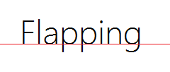
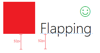
In the above example, the type’s baseline is snapped to a horizontal grid line. That’s not the only way to align type, but it’s very common. To learn about more, read about font metrics. To illustrate the value in aligning type to the grid, see the below example. Which looks better - the top or the bottom image?
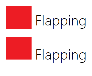
The top example is aligned by descender (the bottom of the p). While the descenders do form a horizontal line, the baseline is visually stronger in this situation. In most cases, designers choose the bottom option. The intent is that the bottom edge of the rectangle is on the same horizontal grid line as the type’s baseline.
The problem
Once you start building, positioning your type by baseline is hard. Your UI framework doesn’t think like you. It puts type in a box that you position with positive (and sometimes negative) margins. You didn’t want to position type by box, you wanted to position type by baseline!
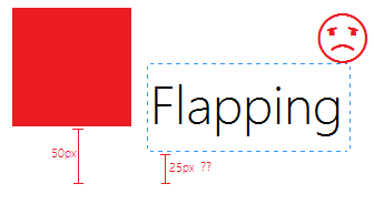
That 25px can really only be determined by guess work. Smashing Magazine explains that in CSS:
…the CSS line-height property doesn’t have an inherent concept of baseline, and each line of text is placed roughly in the middle of the element’s total height.
“Roughly in the middle.” Yuck.
Some frameworks try to remedy the issue. Android has baseAligned. CSS has vertical-align. Both of these cause a good deal of confusion. Try as you might, you’ll find yourself tediously nudging your type into place using margins. You know what you want, why can’t the UI framework think like you do?!
Enter TextLine
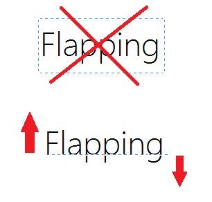
Let’s stop putting type in a box! Let’s think of type as curves that grow from a horizontal line that you get to position. Before, there was a box that imprisoned your type. Now, there’s a line that grows your type. Let’s call this paradigm TextLine.
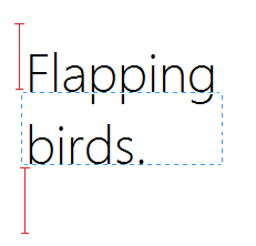
Now positioning makes sense:
This paradigm extends to multi-line scenarios as well. The top margin simply applies to the first line, while the bottom margin applies to the last:
The baseline just one font metric. There’s no need to limit yourself to it. Can type grow out of the cap height line? Yes it can! Center of the em-square? Sure!
With greater power comes greater responsibility. It’s up to you to give your type enough room to grow, else it could clip and be unreadable. But don’t worry it’s not that hard. Use pseudolocalization to see how much space the riskiest glyphs need, then set a top and bottom margin that is at least that much. I’ve found that I barely have to think about it in most cases.
Further benefits of TextLine
This approach has added benefits when it comes time to localize your app. Localization can sometimes make things really ugly. Why? There aren’t very many font families that include the glyphs used in all of the most popular languages. To name a few:
- English
- Chinese
- Japanese
- Spanish
- French
- German
- Russian
Even if your font family does support all of those, what if you ever want to support something more rare like Hindi, Thai, or Sanscrit?
If you have plans of going world-wide, odds are that you’ll need to substitute fonts based on the locale. If your type is in a box, the baseline will move. Why? Different fonts have different font metrics.
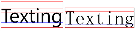
Font metrics for Segoe UI (left) and MS Mincho (right) for the same font size.
Type in a box makes this a headache. You’d have to have different margins for different fonts. Localizing margins? Yuck! Now, it’s simple. You didn’t position a box, you positioned a baseline. Both fonts will render with the baseline in a visually pleasing location.
Prototype implementation
Bending our UI frameworks to treat type this way isn’t exactly easy. CSS doesn’t expose much about font metrics and unless you’re in a Canvas, JavaScript doesn’t either (although here’s a neat hack that can find the baseline, approximately).
XAML exposes baseline and cap height through the TextLineBounds API. It’s a bit hacky, but you can get a simple implementation stood up quickly using XAML’s attached properties. Here’s a screenshot:
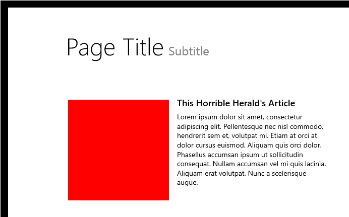
The “Page Title” and “Subtitle” are baseline-aligned. This annoying task has been made dead simple:
<TextBlock
    Text="Page Title"
    FontSize="48"
    ...
    local:TextLine.Mode="Baseline"
    local:TextLine.Margin="120,96,0,0" />
<TextBlock
    Text="Subtitle"
    FontSize="24"
    ...
    local:TextLine.Mode="Baseline"
    local:TextLine.Margin="15,96,0,0" />
Note how both have a top TextLine.Margin of 96, even though they’re different font sizes.
Earlier, I mentioned that baseline doesn’t have to be the origin that type grows from. Cap height is another interesting metric because we frequently have to top-align type with images. This situation is illustrated by the red square next to the “This Horrible Herald’s Article” headline:
<Rectangle Width="200" Height="200" Fill="Red" />
<TextBlock
    Text="This Horrible Herald's Article"
    ...
    local:TextLine.Mode="CapHeight" />
No need for a top margin on either. It just works the way you expect.
Check out the prototype on GitHub. Unfortunately, there are some major issues with this simple implementation:
- Doesn’t work with multi-line TextBlocks
- Grid’s Auto positioning system will clip the TextBlock unnecessarily because we’re changing the Margin late
- Only supports the Baseline and CapHeight modes
A full implementation is certainly possible if you stop using TextBlock and start using DWrite. Perhaps I’ll write one someday.
That’s it. Let me know what you think in the comments!