High Contrast in XAML
Update: I contributed to the official MSDN documentation. It contains everything in this post and more, so go there instead.
High contrast is a source of confusion for many. This is a practical guide that extends the MSDN guidance and sample for developers who would rather not think about it.
When do I need to think about it?
As soon as you need to apply color to any UI (change it from its system default) or need to add images as decoration (ex: image background).
What do I need to do?
Start by creating the proper plumbing, if it doesn’t already exist.
- In App.xaml, create a ThemeDictionaries collection
- Note that App.xaml may not be the most performant choice
HighContrastis not the only available key name. There’s alsoHighContrastBlack,HighContrastWhite, andHighContrastCustom- In almost all cases,
HighContrastis all you need. Forget about the others - read on to see why
- In almost all cases,
- In
Default, create the type of Brush you need (usually a SolidColorBrush). Give it a Key name specific to what it’s being used for:<SolidColorBrush x:Key="BrandedPageBackground" />
- Assign the Color you want for it
<SolidColorBrush x:Key="BrandedPageBackground" Color="Red" />
- Copy that Brush into
HighContrast - Determine what color your Brush should be in
HighContrast
<Application.Resources>
    <ResourceDictionary>
        <ResourceDictionary.ThemeDictionaries>
            <!-- Default is a fallback if a more precise theme isn't called out below -->
            <ResourceDictionary x:Key="Default">
                <SolidColorBrush x:Key="BrandedPageBackground" Color="Red" />
            </ResourceDictionary>
            <!-- HighContrast is used in any high contrast theme -->
            <ResourceDictionary x:Key="HighContrast">
                <SolidColorBrush x:Key="BrandedPageBackground" Color="Red" />
            </ResourceDictionary>
        </ResourceDictionary.ThemeDictionaries>
    </ResourceDictionary>
</Application.Resources>
High Contrast Colors
Determining a color for high contrast requires a bit of learning. If you don’t have time, stop now. The plumbing you’ve created above will make this a simple bug to fix later.
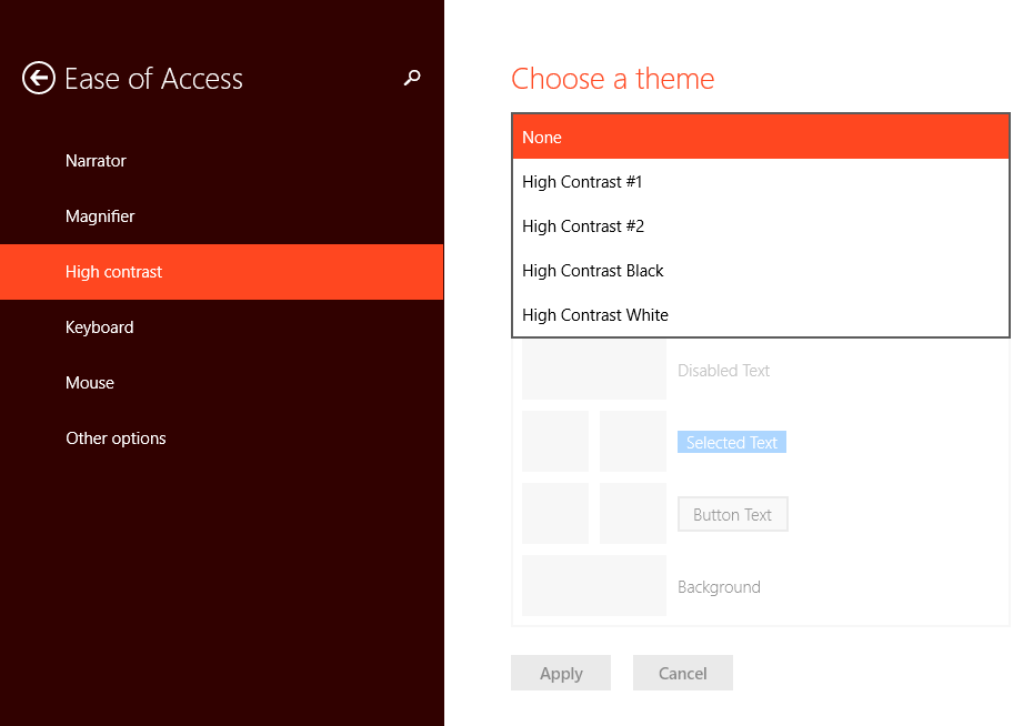
The user can switch to high contrast using the above settings page. They have 4 high contrast themes by default. Once they select an option, the page shows a preview of how apps will likely look. Every square on the preview can be clicked to change its value. Every square also directly maps to a XAML system resource.
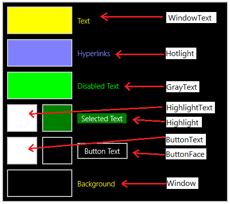
Prefix the names called out above with SystemColor and postfix them with Color (ex: SystemColorWindowTextColor). These will dynamically update to match what the user specified! The documentation for this is poor, but we can learn a bit from how they worked in the WPF days.
This frees you from having to pick a specific color for high contrast. Instead, pick a system resource that corresponds to what the color is being used for. In the above example, we named our SolidColorBrush BrandedPageBackground. Since this will be used for a background, we can map this to the SystemColorWindowColor in high contrast:
<Application.Resources>
    <ResourceDictionary>
        <ResourceDictionary.ThemeDictionaries>
            <!-- Default is a fallback if a more precise theme isn't called out below -->
            <ResourceDictionary x:Key="Default">
                <SolidColorBrush x:Key="BrandedPageBackground" Color="Red" />
            </ResourceDictionary>
            <!-- HighContrast is used in any high contrast theme -->
            <ResourceDictionary x:Key="HighContrast">
                <SolidColorBrush x:Key="BrandedPageBackground" Color="{ThemeResource SystemColorWindowColor}" />
            </ResourceDictionary>
        </ResourceDictionary.ThemeDictionaries>
    </ResourceDictionary>
</Application.Resources>
If you stick to this palette of 8 high contrast colors, you don’t have to create any additional high contrast ResourceDictionaries. This limited palette can often present difficult challenges in representing complex visual states. My advice is to look at other areas of Windows (like Start) and see how they solved a similar issue. Often, adding a border to an area only in high contrast can help bail you out of a situation.
DOs & DON’Ts
DON’T put any Brushes that you create outside a ThemeDictionaries collection
DON’T ever use StaticResource to reference a resource in a ThemeDictionaries collection. This will appear to work until the user changes themes while your app is running. Use ThemeResource instead
DO put primitives like Color, Brush, and Thickness inside of ThemeDictionaries. Avoid putting more complex resources like Styles in them. The following situation works fine:
<Application.Resources>
    <ResourceDictionary>
        <ResourceDictionary.ThemeDictionaries>
            <ResourceDictionary x:Key="Default">
                <SolidColorBrush x:Key="BrandedPageBackground" Color="Red" />
            </ResourceDictionary>
        </ResourceDictionary.ThemeDictionaries>

        <Style x:Key="MyButtonStyle" TargetType="Button">
            <Setter Property="Foreground" Value="{ThemeResource BrandedPageBackground" />
        </Style>
    </ResourceDictionary>
</Application.Resources>

...

<Button Style="{StaticResource MyButtonStyle}" />- DO test high contrast early and often