Intro to Font Metrics
Font files contain a wealth of information about a typeface. Whether you’re a designer or a developer, learning more about how fonts work can open new doors in how you work and what you create.
What are font metrics?
We’ll start with a font. A font is a digital representation of a typeface that consists of a series of glyphs (commonly called letters or characters). Computers read a font file in order to render glyphs on your screen as pixels. To describe how all those individual glyphs should be assembled together into words, sentences, and paragraphs, typeface designers encode the font with metrics.
Font metrics help the computer determine things like the default spacing between lines, how high or low sub and super scripts should go, and how to align two differently sized pieces of text next to each other.
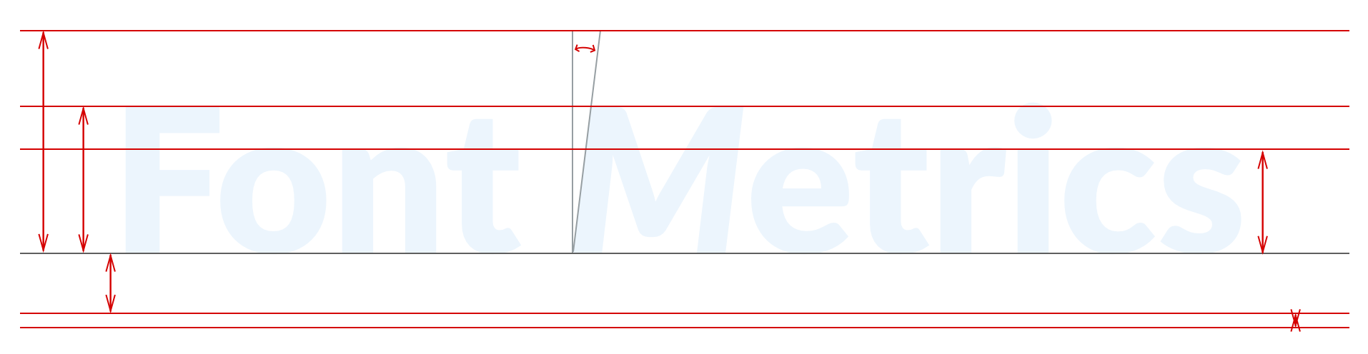
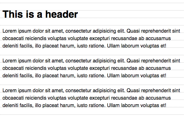
Visualizing a font’s metrics, it looks a lot like guidelines in Sketch or Photoshop.
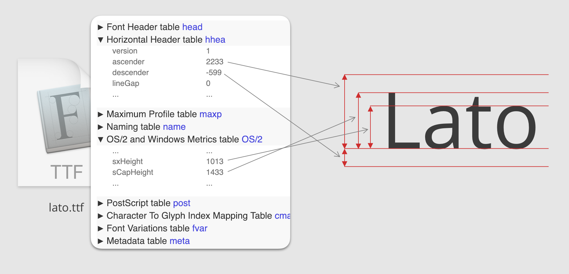
The metrics for lato.ttf, viewed with https://opentype.js.org/font-inspector.html, then visualized.
Your computer is constantly using font metrics, but as a designer or developer, you probably don’t think about them in your day to day. Maybe this is the first time you’ve heard of font metrics.
Similarly, while design and development tools use font metrics under the hood, they don’t often expose them to their users. But they could—and it could change the way you design. To understand how, we first need to talk about the anatomy of type.
A look inside type
There’s an anatomy behind the letters that makes up this sentence. As the example below shows, the curve of an “s” is called the spine—or the white space inside an “a” or “o” is the counter. Then there’s that imaginary line that all letters “sit” on (baseline), the tops of capital letters (cap height), and the tops of lowercase letters (x-height).
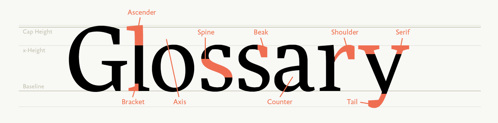
Anatomy of a typeface. Credit: https://www.fontshop.com/glossary.
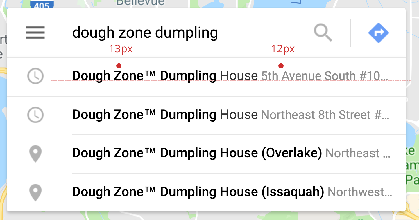
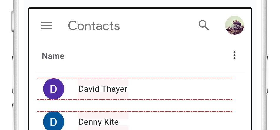
When we practice typography by arranging type on a page or screen, we’re often leveraging different bits of anatomy to create readability and beauty. For example, the search suggestions in Google Maps contain both a place’s name and address.
To help you focus on the most important information (a place’s name), the typographer has set the address in a smaller type size and a lighter color. But to help with readability, both the place’s name and address share a baseline.
The baseline is also helpful for creating vertical rhythm, which may make it easier for readers to jump from line to line, paragraph to paragraph, and section to section.
Another bit of frequently used anatomy is cap height, the top of capital letters. It often helps align your type with the top edge of pictures.

Notification from Airbnb.
Or baseline and cap height can be combined to create a playful container for smaller type.
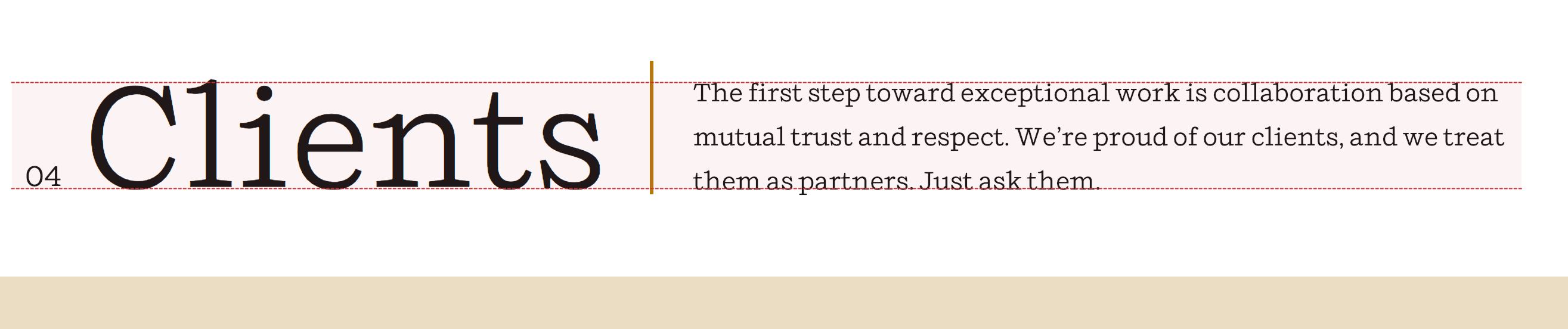
Title / description from https://helmsworkshop.com/clients.
When we vertically center icons with type, we’re usually centering based on the cap height (if the first letter is uppercase) or the x-height (if the first letter is lowercase).
Typographic anatomy plays a big part in our designs. Pieces of that anatomy are encoded in font metrics, which open the door for our tools to help in new ways.
How do our tools use font metrics today?
Font metrics metadata is used by tools like Sketch to power features like smart guides, which can help you snap the baseline to a layout grid.
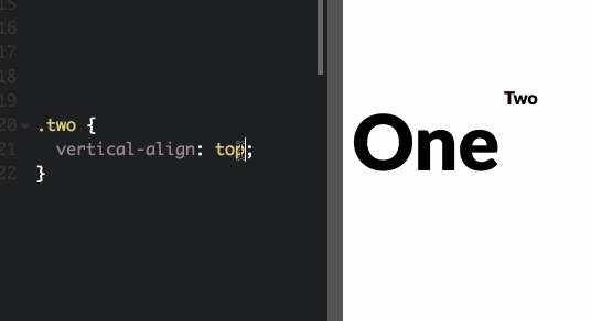
Similarly, CSS’s vertical-align relies entirely on font metrics.
Unfortunately, most of the time, our tools obscure type’s anatomy behind the bounding box.
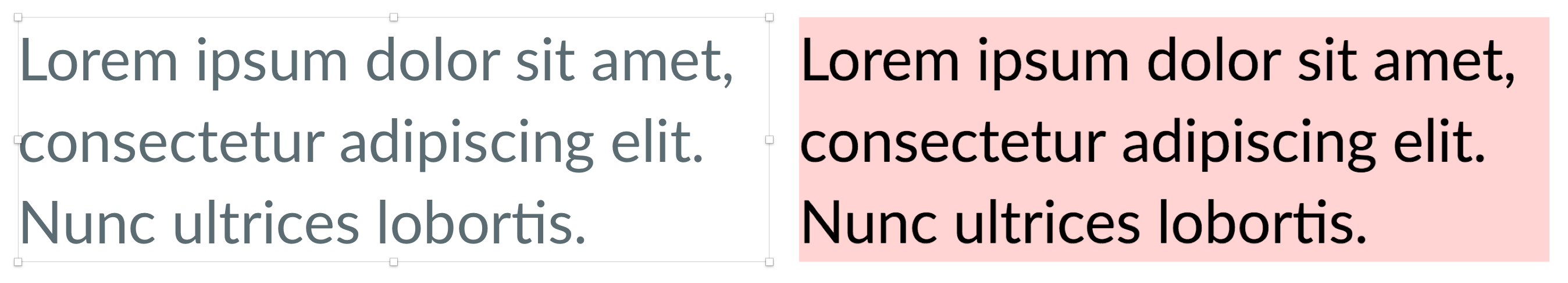
In Sketch, the bounding box is represented by selection handles. In CSS, you can see it by setting a background-color. All type positioning is in relation to the bounding box, so if you wanted 100px from the top of the screen to a paragraph, our tools yield 100px to the top of the box, not to the top of an “L” (cap height) or the bottom (baseline).
While our tools are generally pretty good at helping with baseline alignment, that’s not always true. Multi-column layouts in Sketch can be tricky. If two differently sized headlines are aligned to the bottom of the bounding box, the smaller inevitably looks too low. Care must be taken to create a layout grid for smart guides to snap to or they must be aligned by hand.
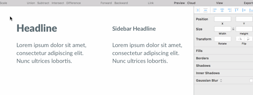
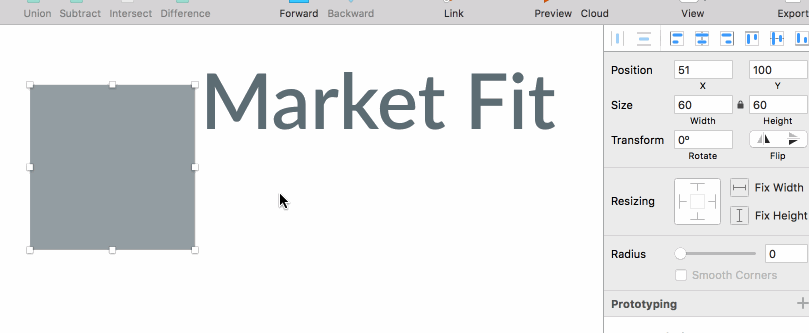
Similarly, top aligning text to an icon doesn’t always work out either. On the left, Sketch’s align top tool. On the right, I aligned with the top of the “L” with the icon by hand. There isn’t any help from smart guides this time.
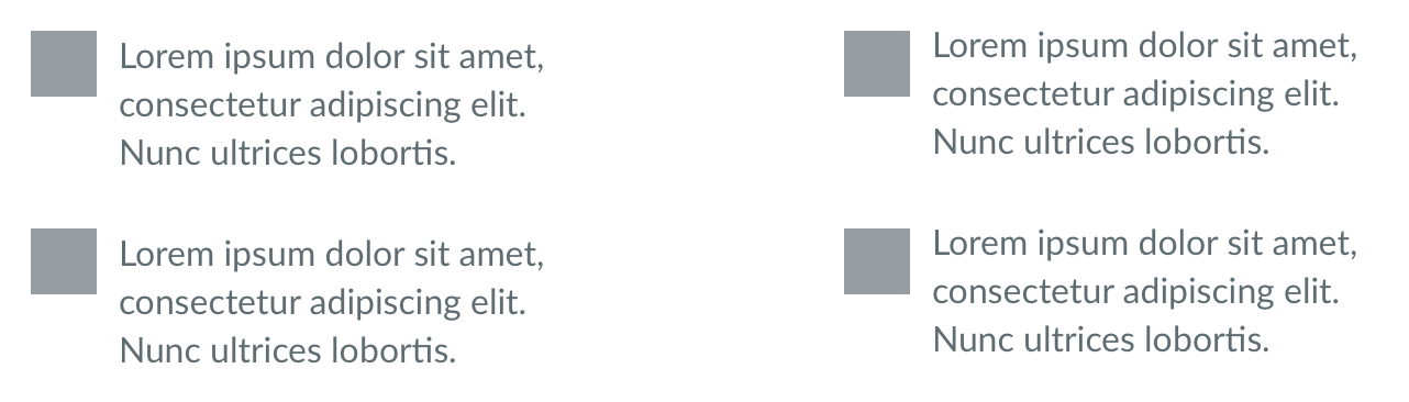
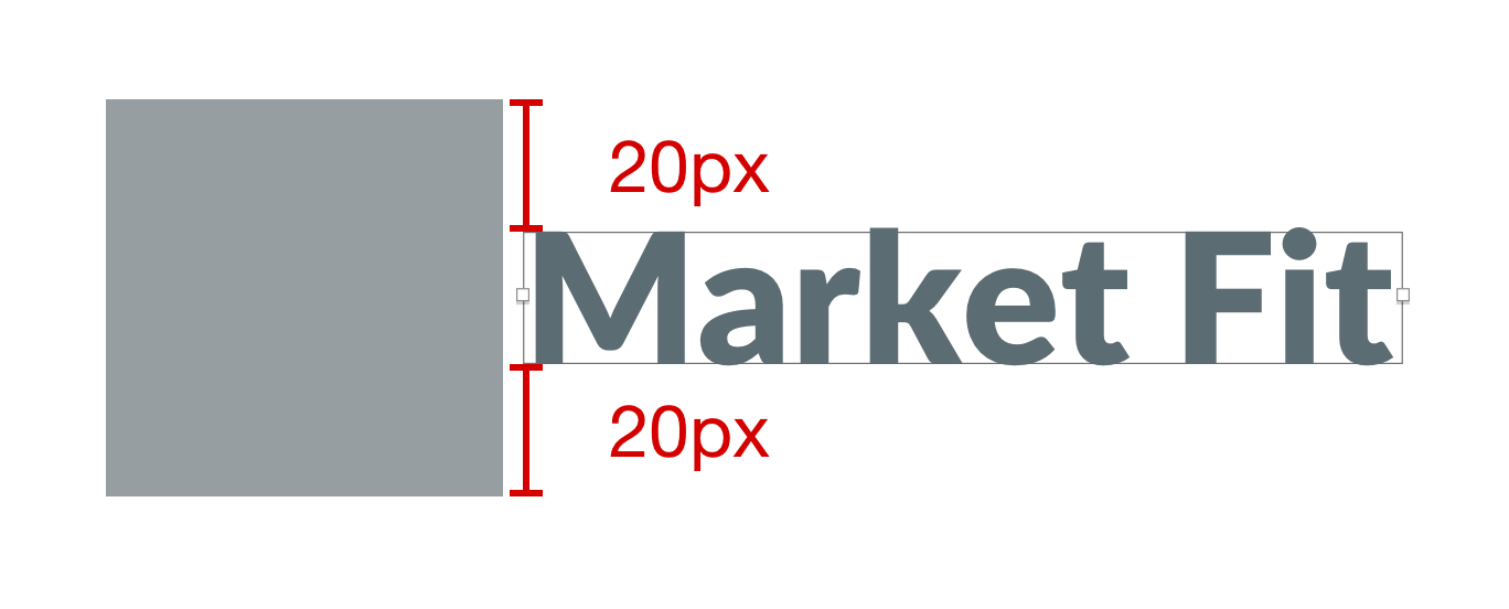
Finally, vertically centering text to an icon is a pain. Using Sketch’s align tool, the text always looks too low. The same is true with CSS flexbox’s align-items: center.
This is because even though the space above and below the text’s bounding box is equal, the space above and below the “M” is not.

Depending on your font and font size, the alignment can often be off by much more than 1px.
In all of these examples, you could “eyeball” it, squinting your eyes or zooming in until things look right. Eyeballing comes with some notable downsides however:
- Translation - eyeballing leads to a lot of seemingly random values for spacing/margins. Say,
margin: 27px 0 18px. If you’re not building the designs yourself, it’s easy for a developer to make a mistake when copying values from Sketch. And if you work on a team with other designers, sticking to a spacing convention (like an 8pt grid) becomes next to impossible. - Maintenance - even if all the spacing values make it into code successfully, it’s easy to accidentally break them with future code changes.
- Flexibility - if the size, line height, or typeface ever changes, you have to carefully eyeball everything again.
With today’s tools, font metrics are usually hidden behind the scenes. But they don’t have to be.
How could our tools use font metrics?
Font metrics enable us to build smarter tools. They are the key to opening the bounding box, exposing the beautiful typographic anatomy inside.
For example, if Lato is the current font, Sketch can read lato.ttf’s font metrics, calculate the distance from the baseline to the cap height, then change the bounding box to snap to that new height. Vertically aligning center now works perfectly.
Once your intent of centering based on cap height is communicated, tools can preserve it. If the icon needs to increase in size or the text decreases in size (like if your users have adjusted the CSS base font size in their browser), nothing breaks.

The same benefit applies if the font changes (maybe your web font failed to load, or you’re using a system fonts strategy).
Writing code becomes easier too—no more align-self: flex-start; margin-top: 13px; to perfectly center the text. If CSS exposed font metrics via a property, like leading-trim, flexbox could take care of everything for you.
.icon-label {
    /*
    trim off the bits of the bounding box
    above the cap height and below the
    ideographic baseline
    */
    leading-trim: cap ideographic;
    /*
    then center using the trimmed height
    */
    align-self: center;
}
Our tools could also use font metrics to look at x-height and suggest a readable typeface for body text, quickly find a suitable fallback font to avoid FOUC, or in some distant future algorithmically suggesting typeface pairings.
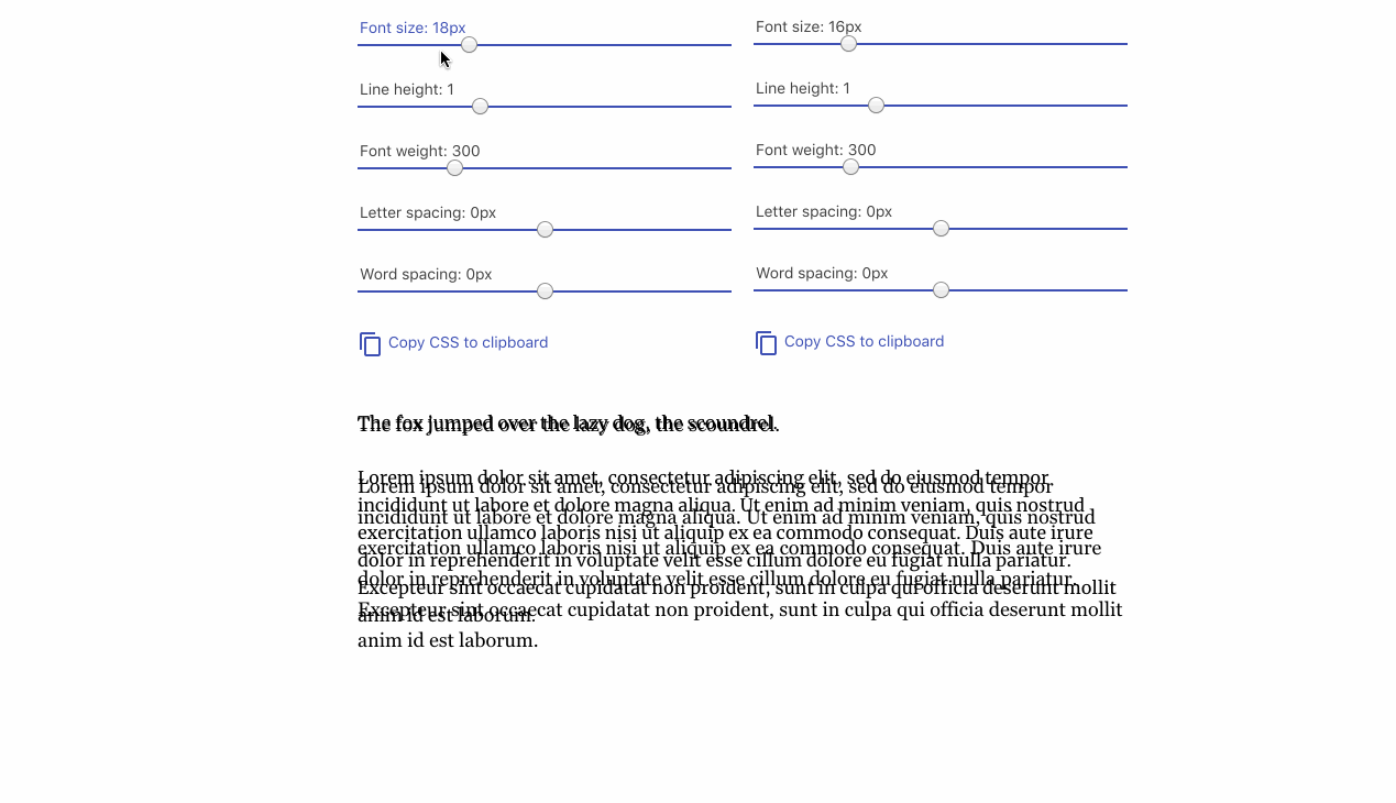
Using Monica Dinculescu’s fantastic Font Style Matcher to avoid FOUC. Could font metrics take out some of the guesswork?
Conclusion
Good typography is hard, but it can be easier with good tools. Embracing the raw anatomical features of type could enable us to create designs that are precise, resilient, readable, and maybe even original.
But it can be hard to get excited over Sketch features that don’t exist and CSS properties that aren’t implemented. Luckily, we can build some of this ourselves! In the next article, I’ll explore how exactly to extract and read the font metrics for your fonts. Once you have the raw data, I’ll explain the math behind using them in layout, and how they can be useful in today’s in HTML and CSS.
Further reading
Font metrics are a low-level implementation detail, but they’re far from boring. If you’re interesting in learning more, check out some of these fantastic resources. And if leading-trim sounds like a compelling CSS feature, check out CSSWG #3240.
- Deep dive CSS: font metrics, line-height and vertical-align by Vincent De Oliveira
- Get Down to the Nitty-Gritty of Text Rendering in Sketch by Yakim van Zuijlen
- Understanding the First Baseline Position of Text by Mike Rankin
- It’s worth noting how our design tools of old (InDesign, Illustrator) expose richer font metrics control than today’s modern tools